azureabstraction > out of the blue

Archive for the ‘Meta’ Category

Cycling through Photos

Saturday, April 14th, 2012

I've been puzzling over how best to display photos from Flickr. On my home page, I show my most recent six photos, which helps keep things fresh for search engines and visitors. The problem is that I generally only upload a photoset every month or two, so the same six photos remain up for a couple months, before switching out for a new set of six photos. Furthermore, those final six photos are probably related to each other, so they won't generally represent the variety contained in the photostream. Here are the possibilities I'm considering:

  1. Display the last six photos. This is my current strategy, and has the disadvantages outlined above. Its main advantage is that it is simple, and requires no history.
  2. Display a random six photos from the last X photos. This has the advantage that it will keep changing, and will have a much greater chance of displaying all of the recent photos from time to time, especially if X is large. It is also quite simple. But the chaotic nature of randomness puts me off a little — a visitor can't know what to expect.
  3. Progressively work through new photos. Each is displayed for a period of time. This spreads the freshness out over a longer period of time, but it is quite complicated. It involves keeping track of all photos posted, and having some algorithm to decide when to move on.
  4. Hand-pick favorite photos from each photoset. This has the advantage of displaying a wider variety of photos, of higher quality, but has the disadvantage of not giving them each a chance. It also means I have to write infrastructure to keep track of favorites, or tie into Flickr's favorite mechanism.

Any thoughts?

The New Design Is Live

Tuesday, January 31st, 2012

My redesign is live. I spent quite a bit of time with this design as a showcase of my knowledge of modern web design. The previous design was around 6 years old, so it was well past time for a facelift. Let me know what you think!

http://azureabstraction.com/

Here is a summary of the features of the new design:

  • HTML5 — I used header, sectioning elements and an IE8 shim.
  • Typekit — This is for the fancy web fonts.
  • OOCSS grids — This is Nicole Sullivan's CSS framework.
  • Responsive design — The basic scheme is closely related to the grid system.
  • Advanced CSS — Take a look at the Flickr stream; it was tricky.

Interestingly, the old design used an early technique similar to responsive design: the horizontal columns collapsed into one vertical column depending on the page width. This was accomplished using floats, percentage widths and something to cause overflow. The new design goes much farther with responsive design, and applies subtle changes to the layout to fit any size screen. Unfortunately, I was unable to use responsive image techniques for my Flickr stream, due to the complicated css to center the square images. I may revisit that, although the technique is impressive in its own right.

This is a screenshot of the old design, for comparison:

Screenshot of the previous design for my home page.

Redesign Teaser

Sunday, January 29th, 2012

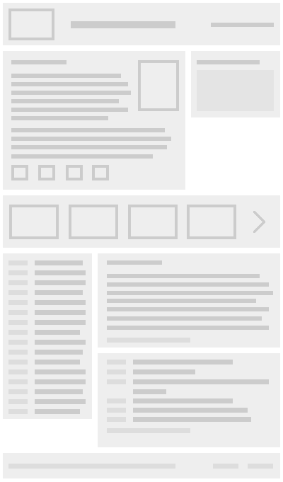
I've been working hard on a redesign of my home page for a couple weeks. I started with a few quick sketches, then created wireframes in Fireworks. I've now built a functional page, which I will push live as soon as I'm done revising the copy and making a few other small refinements. As a teaser, here is the wireframe image.

azureabstraction redesign

Shift in Focus

Monday, January 16th, 2012

I've been thinking about the focus of this blog for some time now. My website is a combination of personal and professional, but this blog has remained solidly personal. In the past I've put off writing technical articles on here. I wanted to wait until I had some method of segregating the content so that people who didn't want to hear about my personal life wouldn't, and people who didn't want to hear about programming and design would be spared the horror. That's not realistic.

At work (and off work) I think a lot about web design, api design, information architecture, and complementary subjects. If I don't write about any of that, there is no way I will be able to write consistently. If I don't write consistently, I won't write at all. Most importantly, there are ideas in my head that need to be recorded in order to critically examine them. There are small javascript projects that should be out there for others to learn from or critique. This blog, at least for now, is the best chance for that to happen.

So I'm going to try an experiment. I'm going to mix articles about my life with articles about design. Maybe it'll take us somewhere new and exciting.